Strict Variants
Dripsy has a variant and variants prop on every component.
Once you've configured your TypeScript setup, these props will get autocomplete.
theme.types.strictVariants
You can customize how strict the types are for your variant props with strictVariants in your theme.
makeTheme({ types: { strictVariants: true, // default },})How it works
By default, a component can use the variant that matches its theme key.
For example, a <Text /> component can use theme.text variants, and TypeScript will error otherwise.
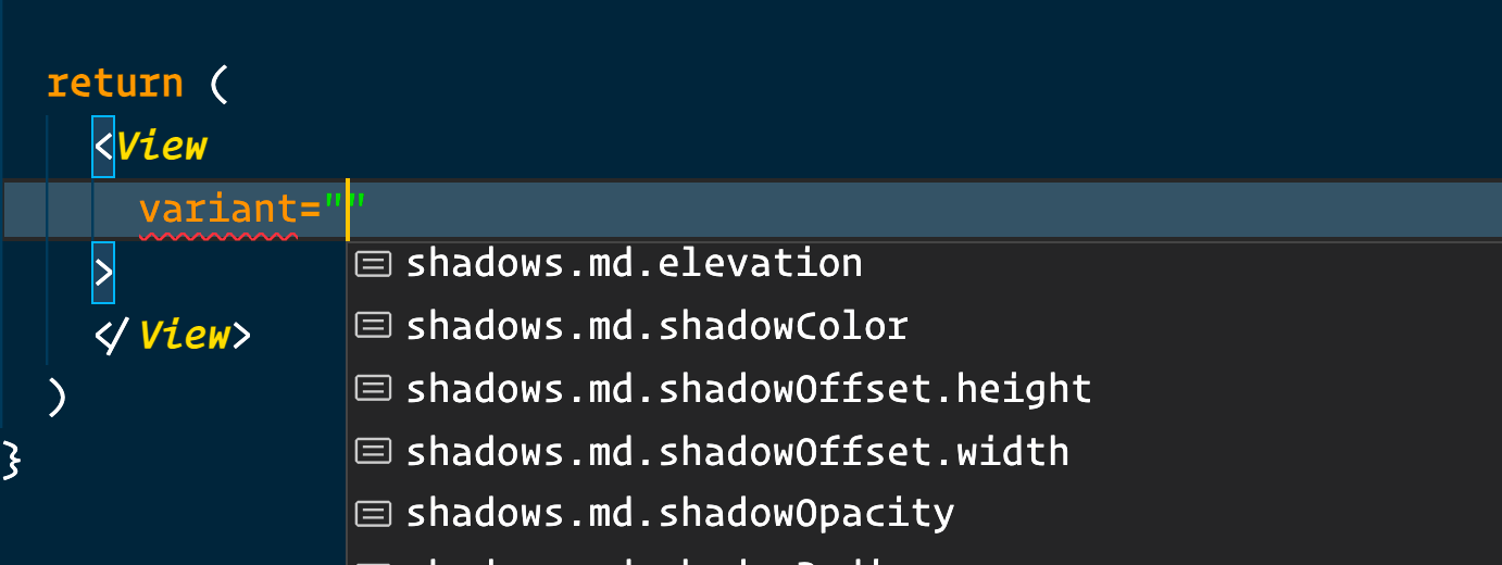
For components that don't have a themeKey defined, such as View, you can use any nested variant from your theme.

Disable strict variants
makeTheme({ types: { // defaults to true // recommended: keep this as true strictVariants: false, },})If you set theme.types.strictVariants to false, then any component, including those with a themeKey, can use nested variants.
For example, with disabled strictVariants, the <Text /> component can now use variants other than those in theme.text.
You probably shouldn't disable this field, though. Strict variants generally are better.
theme.types.strictVariantsonly affects your TypeScript types. At runtime, nested variants will always work.
Variants for custom components.
Using the styled function from Dripsy, you can apply variants to custom components.
import { styled } from 'dripsy'import { View } from 'react-native'const MyContainer = styled(View)()// in your component<MyContainer variant="layout.wide" />With the themeKey from styled, you can get more precise autocomplete for your variants.
Let's say we want MyContainer to access theme.layout variants.
import { styled } from 'dripsy'import { View } from 'react-native'const MyContainer = styled(View, { themeKey: 'layout',})()Now, you can use variants from theme.layout on MyContainer.
const theme = makeTheme({ layout: { wide: { maxWidth: 1100 } }})// in your component<MyContainer variant="wide" />Read about all the things you can do with the styled function, such as setting the default variant for a component.